
Over the last couple of days I've seen a few people mention how similar the ABC Australian logo is to the new Disney Movies Anywhere service. I don't know much about the legal side of things, but I thought an explanation of why the ABC logo looks the way it does might be interesting.
The shape of logo is called a Lissajous figure or curve. The shape is generated by a parametric equation where the x and y coordinates are sinusoidal. The frequency and phase relationship between the two equations for x and y determine the shape. In the case of the ABC logo, the frequency of the y coordinate is 3 times that of the x coordinate and there is a 90 degree phase shift (I'll clarify this later) applied the y equation.
$$$x=cos(t)$$$ and $$$y=cos(3t+\pi/2)$$$
To make things clearer I've put together an animation. As the vertical bar sweeps across the screen it will intersect the x and y equations. The y coordinate is projected across and the x coordinate is projected across and up. The Lissajous figure is drawn where the project lines intersect.
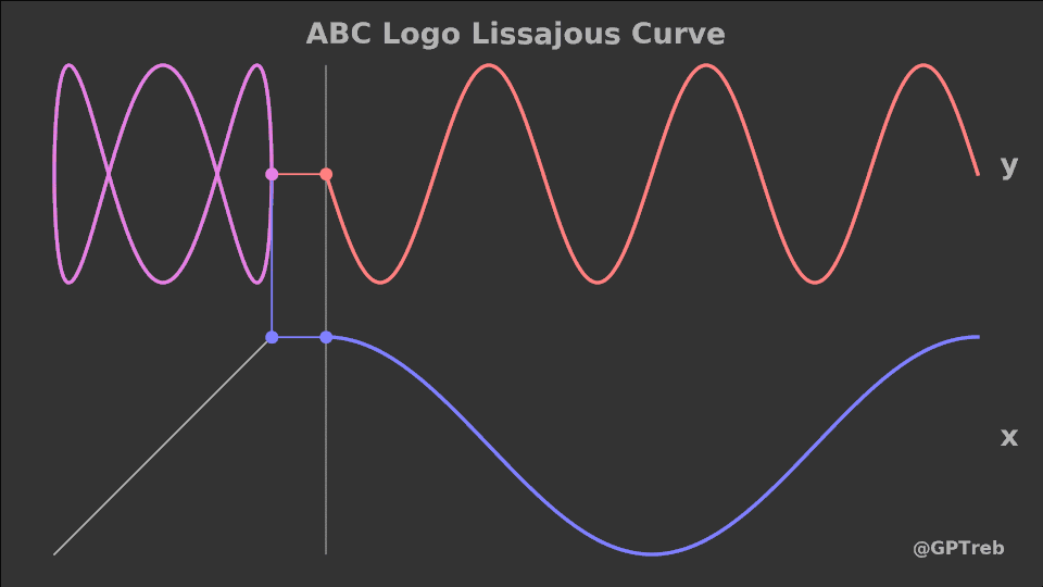 |
| Tracing a 3:1 Lissajous Curve x=cos(t) y=cos(3t + $$$\pi$$$/2) |
The phase shift is also very important to the shape. In the animation below you can see how the it changes as the phase shift is cycled across all possible values from 0 to $$$2\pi$$$.
 |
| Changing the phase relationship of a Lissajous Curve x=cos(t) y =cos(3t + $$$\delta$$$) |
These curves aren't just a mathematical curiosity, they have a real world application. They used to be a very important tool for broadcast engineers. If two signals are feed into an oscilloscope (a tool that plots electrical waveforms) while it's in x-y mode, the Lissajous curve on the screen will reveal things about the signals.
The first thing to notice is that the number of horizontal and vertical lobes indicates the ratio of the frequencies. If the ratio of frequencies is rational (can be expressed as the ratio of two integers) the curve will be stationary. If not, it will slowly rotate like the second animation. If the two signal are meant to be locked together so that one is exactly 3 times the other like in the example above but the curve rotates, you know there's a problem. The rotation rate of the curve tells the engineer the deviation from the desired frequency. There are simple lookup tables like the one below that show what the curves should look like for a given phase shift and frequency ratio.
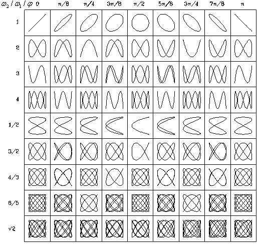 |
| Frequency Ratios and Phase Differences |
Earlier I said I'd elaborate on phase shift. The main thing to note is that you are working with two different frequencies. 1 degree of phase shift on one signal will take a different amount of time to 1 degree of phase shift on the other. So it's important to not just note that there is a phase shift of 30 degrees, you have to specify what waveform you are referring to. That's why a lot of the table results may be different from what you measure. In a mathematical sense, it also makes a difference if you are talking about sine or cosine signal as one is a phase shifted version of the other.
Just to clear up another thing as well. The second animation is generated by plotting a waveform frame and then changing the phase an repeating this process. This is what makes it rotate. By chance though, this is exactly what you would see if the frequencies weren't locked together. A time varying phase is no different to making a small deviation to the frequency.
No comments:
Post a Comment
Note: Only a member of this blog may post a comment.